Well, I did it. I painted our entrance.
Using DVF Fall 2012 as inspiration:
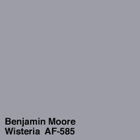
Yet I decided to go with a more muted gray color:
Ben Moore Wisteria:
It still needs a second coat, but I couldn't wait to share:
It matches our BOB and my iPhone and everything I wear- since 90% of the time I am wearing something purple. I think my purple obsession is becoming a problem!!
Plus, I have two new inspirations:
First, Mr. Spice has given me free range over the boob light above to do something like this, from the fantastic Emily Henderson:
(at least until we have the budget to replace it with something that reflects light better).
Second, I found inspiration over on Love & Renovations. A fantastic little home remodel blog of a super cute couple!! I want a Cutting Edge Stencil for this space, STAT:
Initially, I wanted the Birch:
But with the purple, I am thinking something more sophisticated:
What do you think of the purple gray??
And for the stencil- fun or sophisticated??
(We really aren't sophisticated people, but maybe I can use the fun in the guest room??)


2 comments:
I really like the second stencil, I think it's a fun pattern ;-)
And I'm also all about purple gray, we have it in our bedroom.
It looks so good! I love the color you used. And, um, I'm of course a huge advocate of the second stencil. I loooooove it!
Post a Comment