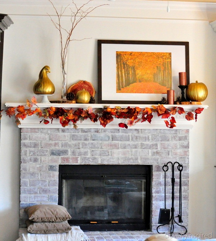
Hey Everyone, Today I am participating in the Autumn Link Parties: Fall Mantels with Kate from Censational Girl.
I have to admit, our mantel isn't anything that crazy or super exciting, I dressed it up with less than $10 worth of flowers and a couple small pumpkins (I am really waiting to get on the pumpkin action when we take Sugar Bear to the amazingly awesome wine country pumpkin patch, which hasn't opened yet!).
So that said, I need your help on a design question. Right now the pictures are just leaning on the mantel. My original intention was to hang the pictures, but Mr. Spice likes that they are just leaning.Here's the debate:
Hang them: It will take up some of the visual space above the mantle and it will free up the actual mantel for more seasonal specific decor.
Example- with the pictures hung, you can add more stuff:
Don't hang them: It looks cool, and it will give you free reign to switch the whole look up whenever you want to?? I like that this mantel looks really similar to ours, but their ceiling looks lower, or is that just a trick of a bigger picture and tall sticks??
Or do a mixture of both??
I am excited to see what others do with their Fall Mantels. Leaning or Hanging?? I'd love to know your thoughts.


No comments:
Post a Comment